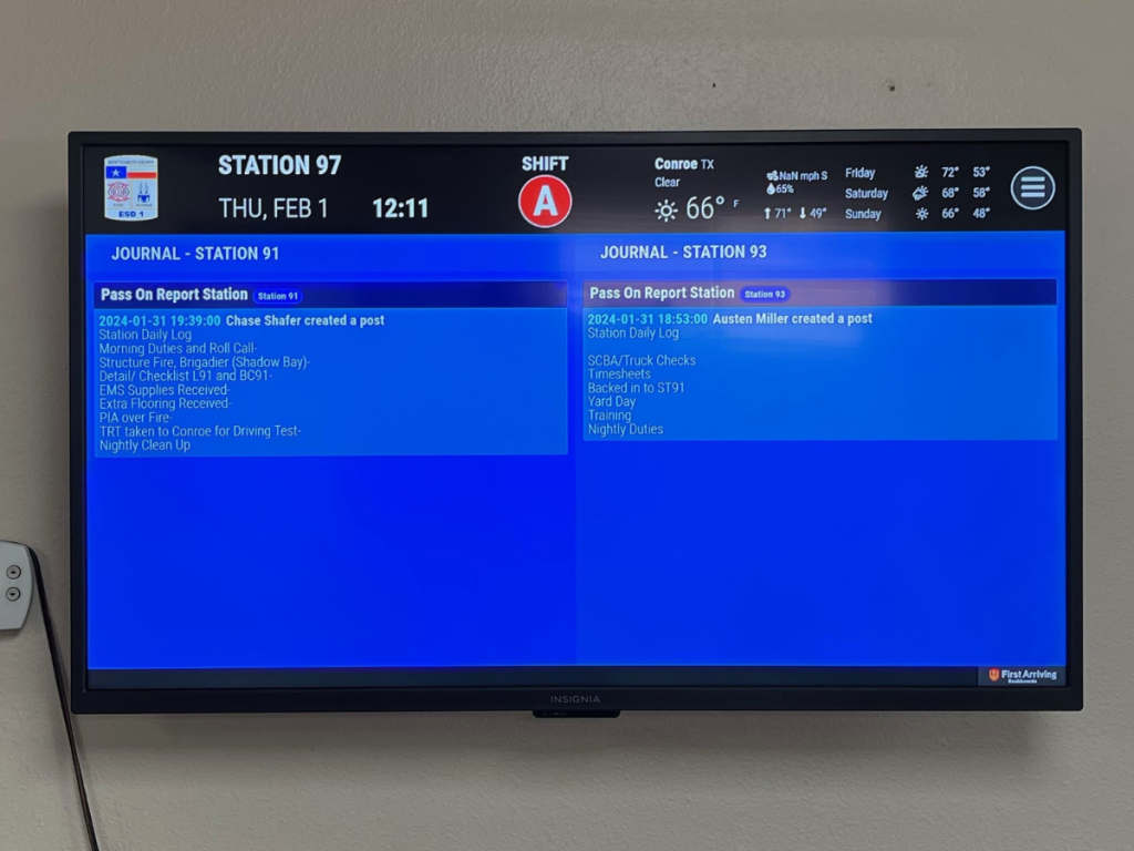
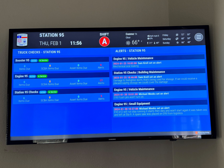
Before leadership at the Montgomery County ESD 1 in Texas installed Dashboard technology by First Arriving at their eight stations, they typically relied on email to get the word out about training, events and more – but have since discovered that digital signage makes their communication far more effective.
It was their assistant chief during 2023 who learned about the technology and brought the idea to the department, said Deputy Chief of Logistics Michael Olson. “One of the reasons we decided to go with that was to help better get information and data out to our employees,” he said.
When it came to email or other team communications products, messaging was easily missed or quickly buried. “Sometimes the troops don’t look at that or go through it very frequently,” Olson noted, “so what we have done, is we are able to put that stuff on the dashboard for them to view as they are on shift at the station, and it’s really helped with getting that information out… training classes, training schedules, things like that.”
To begin, they tested the system in their admin building to see how it would work and to make sure they had it set up correctly before pushing it out to all of their stations, Olson said. Then they added it at each of their six staffed stations and at their logistics building, and have seen an improvement from when they relied on email and on battalion chiefs to get the word out.
“We still use those avenues for our information as well, so they’re still getting it the same way we have been,” Olson said. “But now with incorporating the dashboard it just helps with getting that information repeated, and shown on a screen instead of just relying on word of mouth or them expected to read their email.”
The difference is especially apparent in their ability to see and share current stats including call volumes, turnout times, and response times.
“We were interested in that to kind of bring out more of the competitiveness amongst the shifts,” Olson said. “We also have our schedule on there so members can see who’s on without having to log into the system.”
Reception at the department has been positive, Olson said. When their dive team used Google Slides to post a QR code for personnel to scan to sign up for dive classes, several members noted that the reminder made a difference.
“That got sent out through email as well, but there were a couple members that said that they were sitting there, eating lunch, and that popped up.”
With that reminder, they said, they took out their phones, pulled up the QR code and sign up on the spot.
“It’s just an easier way to get information out to everybody that’s at the station,” Olson said.
Members also particularly appreciate the map, Olson added, with the ability to see where they’re going and to have call notes visible. Real-time ticker updates are also a hit, as they scroll information across the bottom of the dashboard screens. In a recent example, there was flooding in the area, and at the same time that road closures were occurring and personnel were reporting additional areas with water, Olson was able to push out that information to the dashboards.


