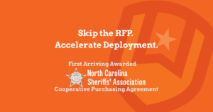
First Arriving Expands Access Through National Cooperative Purchasing
First Arriving is proud to announce that we have been awarded a contract under NCSA Technology Bid 27-06-0212, effective March 16, 2026, through March 15, 2027.
This award enables local government agencies nationwide—including law enforcement, fire, EMS, and multi-disciplinary departments—to purchase First Arriving’s real-time information platform through a streamlined, pre-approved procurement process.
For agencies looking to move faster, reduce administrative burden, and deploy modern operational technology, this contract removes one of the biggest barriers: procurement complexity.
What This Means for Public Safety Agencies
Through this NCSA contract, agencies can now:
- Accelerate purchasing timelines without lengthy RFP processes
- Leverage a nationally vetted contract for compliant procurement
- Access proven technology already in use by departments across the country
- Simplify vendor evaluation and approval workflows
In short: agencies can focus less on paperwork—and more on improving operations, communication, and situational awareness.
A Trusted Procurement Path via NCSA
The National Cooperative Sheriff’s Association (NCSA) provides a centralized procurement resource designed specifically for public safety agencies.
Through the NCSA Technology procurement portal, agencies can access:
- Vendor directory and awarded providers
- Final award documentation
- Technology offerings by category
- Contract agreements and supporting materials
This “one-stop” procurement model ensures transparency, compliance, and ease of access for agencies evaluating new technology solutions.
Supporting the Next Generation of Operational Awareness
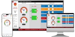
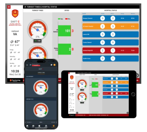
First Arriving’s platform helps agencies solve a growing challenge: too much data, not enough clarity.
By integrating over 130+ data sources into a single, unified platform, First Arriving enables:
- Real-time incident awareness
- Department-wide communication and alignment
- Role-based visibility across stations, command staff, and field personnel
- Access across dashboards, web, tablet, and mobile—24×7×365
Rather than adding another tool, the platform connects the systems agencies already use, turning fragmented data into actionable insight.
Built for Law Enforcement, Fire, EMS, and Local Government
With this contract in place, First Arriving is positioned to support a wide range of agencies, including:
- Sheriff’s Offices and Police Departments
- Fire and EMS Agencies
- Emergency Management and Multi-Agency Operations
- Local Government Organizations
Each deployment is tailored to the agency’s operational needs, ensuring the right information reaches the right people at the right time.
What Happens Next
Agencies interested in leveraging the NCSA contract can now:
- Access contract details via the NCSA procurement portal
- Engage directly with First Arriving for demos and scoping
- Procure through the awarded contract without issuing a separate RFP
This creates a faster path from evaluation → approval → deployment.
A Commitment to Public Safety Innovation
This contract reflects our continued commitment to helping public safety agencies reduce noise, improve clarity, and operate more effectively in real time. As agencies face increasing complexity, staffing challenges, and data overload, the need for a unified information platform has never been greater.
Learn More
To learn how your agency can leverage this contract or see the platform in action:
Request a demo | Explore integrations and capabilities | Connect with our team